Last year, I wrote about the Reef Life Survey (RLS) project and my experience with offline data collection on the Great Barrier Reef. I found that using auto-generated flashcards with an increasing level of difficulty is a good way to memorise marine species. Since publishing that post, I have improved the flashcards and built a tool for exploring the aggregate survey data. Both tools are now publicly available on the RLS website. This post describes the tools and their implementation, and outlines possible directions for future work.
The tools
Each tool is fairly simple and focused on helping users achieve a small set of tasks. The best way to get familiar with the tools is to play with them by following the links below. If you’re only interested in using the tools, you can stop reading after this section. The rest of this post describes the data behind the tools, and some technical implementation details.

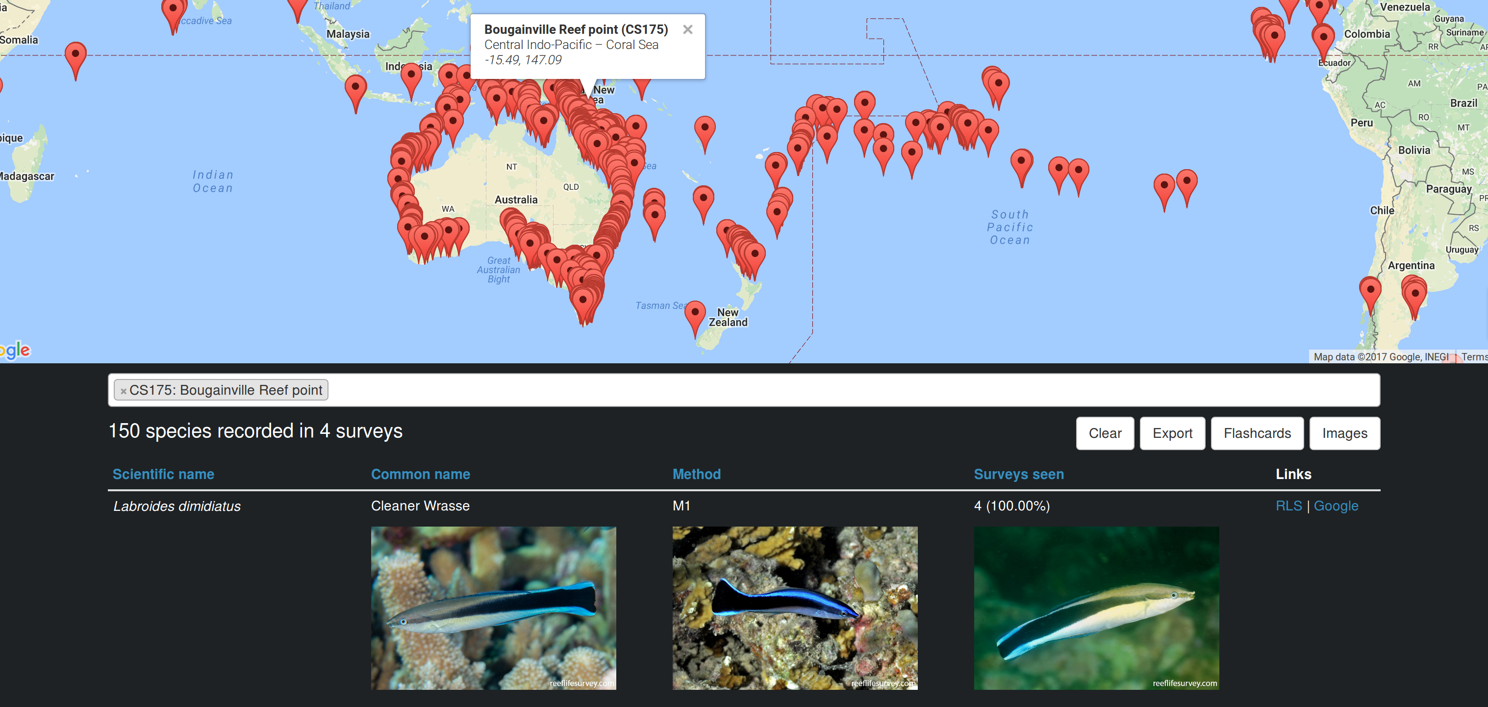
The Frequency Explorer tool lets users select RLS sites and view the species that have been recorded there (RLS website | full-screen version).
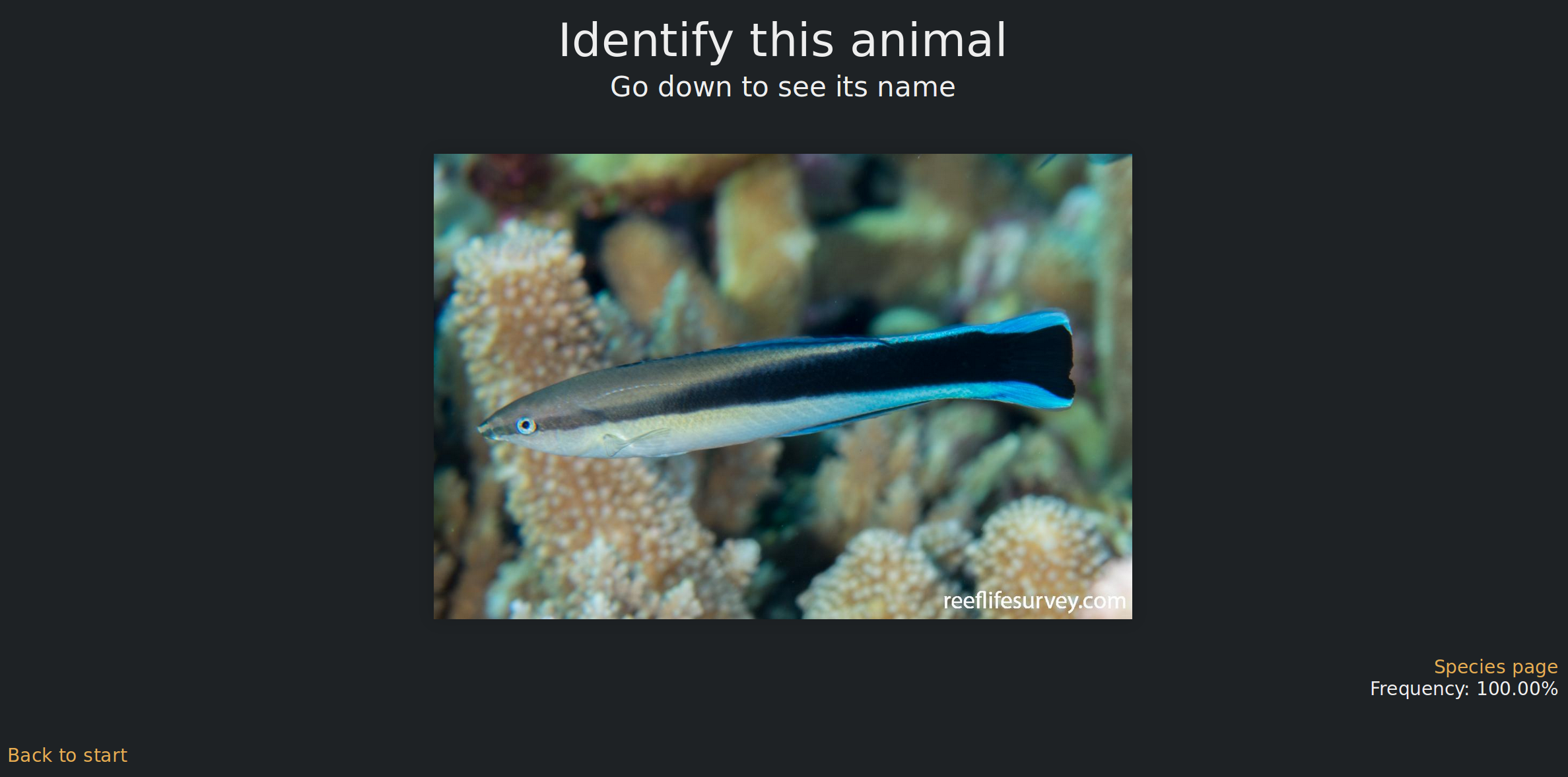
The Flashcards tool helps users memorise the names of marine species by showing random images of species from a chosen area (RLS website | full-screen version).
The data
The RLS database includes data collected by volunteer scuba divers on the diversity and abundance of marine life in sites around the world. An RLS survey is performed along a 50 metre tape, which is laid at a constant depth following a reef’s contour. After laying the tape, one diver takes photos of the bottom at 2.5 metre intervals along the transect line. These photos are analysed later to classify the type of substrate or growth (e.g., hard coral or sand). Divers then complete two swims along each side of the transect. On the first swim (method 1), divers record all the fish species and large swimming animals found in a 5 metre corridor from the line. The second swim (method 2) targets invertebrates and cryptic animals, and requires keeping closer to the bottom and looking under ledges and vegetation in a 1 metre corridor from the line. The RLS manual includes all the details on how surveys are performed. The data collected in the surveys is available for download from a Data Portal hosted by the Institute for Marine and Antarctic Studies at the University of Tasmania. As of early June 2017, the downloadable dataset consists of over half a million data points from almost ten thousand surveys.
When I first started studying marine species, I had to find a source for photos. Initially, I used Scrapy to build simple scrapers that downloaded photos from sites such as The Australian Museum, Fishbase, and Fishes of Australia. Last year, RLS made a large number of high-quality photos taken by volunteers available on their site (via the Species Search function). In addition to their high quality, an advantage of the RLS photos over images from other sources is that they were all taken in situ, i.e., in each animal’s natural habitat. On the other hand, other sites also include photos of dissections and hand-drawn illustrations, which aren’t as useful for divers who want to see marine animals as they appear in the wild. Working exclusively with the RLS image dataset has significantly improved the appearance and usefulness of the tools I built.
The raw RLS survey data comes in the form of over 100MB of CSV files. For the purpose of building the tools, I summarised the data into two JSON files with an overall size of less than 3MB (less than 1MB when compressed). This made it possible to implement both tools as single-page apps that don’t require any requests to the server after the initial fetching of the data. The two summary JSONs are:
species.json– a mapping from species ID to an array of five elements: scientific name, common name, species page URL, survey method (0: method 1, 1: method 2, or 2: both), and images (array of URLs).site-surveys.json– a mapping from site code to an array of seven elements: realm, ecoregion, site name, longitude, latitude, number of surveys, and species counts (mapping from each observed species ID to the number of surveys on which it was seen).
Both files use mappings to arrays rather than nested objects to reduce the download size. I originally created the files myself by downloading the CSVs from the data portal and scraping the RLS website for images and common names. Static versions of those files from early June 2017 can be found on GitHub (species.json and site-surveys.json). As part of the integration with the RLS website, the RLS developers will implement live versions of the files, which will get updated automatically. I’ll add the links to the live versions when they become available. Please let me or the RLS team know if you find any issues with the data.
The approach I chose to produce the species counts in site-surveys.json doesn’t take abundance into account, i.e., each species is counted once per survey regardless of the number of times it was seen on the survey. Ignoring abundance means that for sites with few surveys, the species count may not be a good indicator of future likelihood of occurrence. For example, some fish are solitary and seen rarely, while others occur in schools and are likely to be seen on every survey. However, this is less of an issue for sites with many surveys. In addition, this simple counting approach is easier to explain than some approaches that do account for abundance.
Implementation details
The source code for the tools can be found in my GitHub Pages repository. Each tool is a simple single-page application, consisting of three files: index.jade, main.coffee, and style.less. In addition, the root source directory contains some common code in common.less and util.coffee, as well as configuration files for npm and Grunt. Grunt is used to compile the source files from Jade/Pug, CoffeeScript, and Less to HTML, JS, and CSS respectively. These files are then served statically by GitHub Pages.
The common CoffeeScript code loads the JSONs asynchronously, and processes them into nested mappings that are easier to work with than arrays. In addition, the common code contains a method to summarise counts from multiple sites, by aggregating them as simple sums. This means that sites that are surveyed more frequently get weighted more heavily. For example, if a certain fish X was seen once in site A, twice in site B, and never in site C, its count across A, B, and C is 1 + 2 + 0 = 3, but if A was surveyed once, B was surveyed twice, and C was surveyed seven times, X’s aggregate frequency is 3 / (1 + 2 + 7) = 30%. In the future, it may be worth normalising each site’s species counts by the number of times the site was surveyed (making X’s aggregate frequency (1 / 1 + 2 / 2 + 0 / 7) / 3 = 66.67%), but then rare species in rarely-surveyed sites may be overweighted.
The Frequency Explorer tool uses the Google Maps API to show a map with all the past survey sites. Users can select sites by drawing an area on the map, or by searching for site names in a Select2 box. The tool fails gracefully when Google Maps isn’t available, which makes it possible to run it offline (assuming you have local copies of the species images). This was very useful on my last trip to the Coral Sea, where I was away from mobile reception for weeks. When sites are selected, the code generates a summary table of the species frequencies, which can be exported to a dynamically-generated CSV. In addition, users can choose to display images of all the species in the table. As this can trigger the download of thousands of images, I used vanilla-lazyload to only load images when they enter the viewport. Finally, Frequency Explorer can also be used as a site selector for the Flashcards tool, as it contains a link to launch Flashcards with the set of selected sites (which is passed in the Flashcards query string).
The Flashcards tool relies on the excellent reveal.js library to dynamically generate a presentation with a random subset of images of species that were recorded at the selected sites. The presentation consists of pairs of image and name slides – each image slide is followed by a slide where the name of the previously-shown animal is revealed. As I found that trying to memorise all the species at once is too hard, I added the ability to adjust the difficulty level of the flashcards by setting a frequency threshold (e.g., show only species that were recorded on 25% of surveys), or by focusing on observations from a single survey method (e.g., method 2 surveys in the tropics tend to be much less diverse than method 1 surveys). To avoid reloading the entire page when the settings change, the slides are regenerated dynamically. Reveal isn’t really built to account for dynamic regeneration of slides, so I had to add a call to Reveal.toggleOverview(false) to get the cards to refresh correctly, but other than that it worked perfectly.
Future work
There are several possible extensions to the work done so far.
First, the integration of the tools into the RLS website is incomplete. They are still served in iframes from my GitHub Pages account, and the JSON data isn’t updated automatically. Completing the integration is dependent on the RLS developers, who also have other priorities. Other RLS-dependent items include better optimisation of images (they’re currently scaled down on the client side), and general performance improvements to the site.
Second, the tools themselves could be improved. For example, reliance on third-party libraries should be reduced (e.g., Frequency Explorer uses Bootstrap due to my limited design skills), and it’d be nice if site selections were stored and read from the URL of Frequency Explorer (this is already done for Flashcards). In addition, as the tools are used to train new RLS divers, it’d be useful to extend the Flashcards tool to run in test mode, where users would type in the names of the animals rather than just passively scroll through the presentation. This would make it possible to assess diver readiness to perform surveys based on their test scores.
Finally, many other interesting things can be done with the RLS data (in addition to producing scientific papers and reports, which is the main focus of the researchers behind the project). Examples include using the images to automate species identification (as discussed more thoroughly in my previous post on the topic), and building models to predict survey output and detect anomalies (e.g., due to climate change or other unusual factors). If you have other ideas, or end up playing with the data and coming with interesting results, please share your findings in the comments section.
Public comments are closed, but I love hearing from readers. Feel free to contact me with your thoughts.